Ecommerce Website Design 101: How to Position Your Online Store for Growth

Do you have an online store? Do you have the right ecommerce website design to fetch enough customers?
No matter how long your business is in operation, you need to attract the right customers to lead your organization to a brighter future.
E-commerce website Design is one significant aspect that plays a crucial role in fetching the right audience. According to statistics, around 94% of people said they would not recommend poorly designed websites.
With rapid changes in marketing and design, it gets tough to catch up. But there are some common points that a website designer should swear by at all times.
This article has covered all the best ways to help you position your store on top. We have compiled detailed information on designing your website and the differences between B2B and B2C websites. Let’s dive into it.
3 Main Types E-commerce Platform
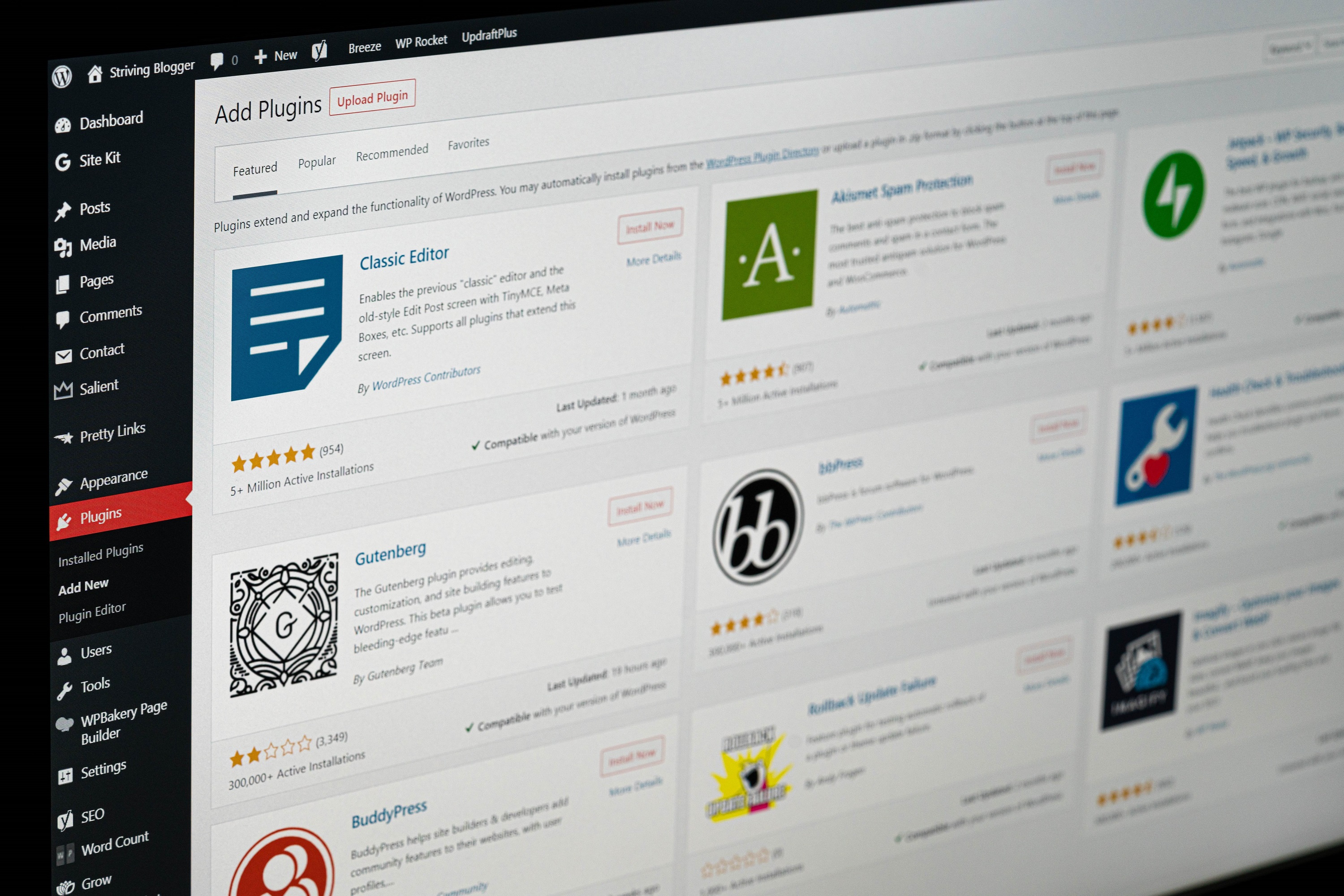
Before planning on building an ecommerce website, it’s crucial to have a well-functioning e-commerce platform. There are majorly three types of e-commerce stores that cover almost all the features and toolkits required to build a high-quality website:
- Open-source
- SaaS
- Headless commerce
Each platform mentioned above is compatible with serving the customers’ needs. All these platforms are integrated with almost similar features like a checkout page, payment gateway integrations, etc. The only point of difference among these platforms lies in their level.
SaaS Platform:
With the help of a SaaS Platform, you can create a unique e-commerce store design that includes all the basic features. In addition, this platform has limited designs and custom features, making it an ideal choice for beginners or novices.
Open Source:
Open Source platform is like a blank slate. You have to create everything from scratch, which means that the help of a professional designer and coder will be required at all times.
Headless Commerce:
The e-commerce platforms made using headless commerce are constructed by keeping flexibility as a priority. With the help of this platform, you can create specialized shopping experiences with a powerful commerce engine in the backend. In headless commerce, the front and back end are separated, allowing the store’s owner to access the overall platform at any time.
Pro Tip: One can always make use of more than one e-commerce platform to build up a more user-friendly and responsive website.
No matter whichever platform you pick for constructing a website, there are a few features that are a must to be included while constructing a website:
Features of a Succesful E-Commerce Website

Responsiveness
According to research by Good Firms, around 73.1% of web designers thought that a non-responsive website could be a top reason why visitors leave online stores. No matter how many amazing features you have added to your online store website, if it’s not accessible to the customers over their devices, they will leave immediately.
Therefore, a responsive ecommerce website needs to provide a great on-site experience to customers anytime and anywhere without distorting the web design.
Options for customization:
When it comes to an online store, website design is something that one cannot keep aside. It is that one factor that differentiates your online store from all the other stores and helps you gain loyal customers. However, if you are stuck with all the old-school templates and bring no newness to your store’s chances, you might lose out on several of your clients.
Easy Site Navigation:
Have you personally come across any website with disorganized navigation? How was your experience with that site? Did you make any purchases? Will you ever shop from that site again?
Well, answering all these questions will help you understand how important navigation is for an eCommerce website. Navigation is crucial for a website to help its users reach that specific area on the website.
Let’s understand this with an example: Suppose you have an eCommerce store that deals with selling jewelry. If the website is poorly designed, your customers won’t be able to find the specific set they are looking for. This will lower your conversion rate and hinder your business’s growth. So, focus on your website’s navigation and make it user-friendly.
Compelling User Experience:
Ever thought about what makes a user hit that purchase button and come back for more?
User experience makes sure that the users enjoy surfing the website. This feature plays a pivotal role in making the website not just functional but reliable as well. If you are looking for great reviews, repeat purchases, and word-of-mouth recommendations, then user experience is something you need to diverge your focus onto. Use user-friendly WordPress themes to attract more customers to your e-commerce store.
After understanding all the essential features required to make an amazing website, let’s take a quick look at B2B and B2C e-commerce and their core differences.
What Is B2B and B2C E-commerce?
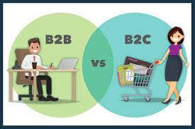
A B2B (Business to business) is an eCommerce model where a company sells things to other businesses. Usually, in this situation, the seller is a manufacturer or a wholesaler, and the buyer is a retailer. After this, the retailer further sells the product to the customers, turning it into a B2C (Business to Customer) model.
When both models are put against each other, B2B tends to be viewed as more complex than B2C. This is because the B2B model involves more research and focuses on purchases driven by needs. Apart from this, there are some more differences between B2B and B2C Ecommerce website models:
Difference between B2B and B2C E-commerce Websites
Product-Oriented Content:
A product-oriented content has everything that will help buyers in making a decision.
B2B:
In a B2B eCommerce setup, buyers are usually more inclined to learn about the products independently. They are usually more inclined toward websites with ample product information, which increases their overall buying experience.
Here are a few things that should be included on a B2B website:
- Well-researched product videos
- Blogs that consist of everything A to Z about the products
- Case Studies which consist of success stories from previous customers to help them feel confident about their decision
- Full-fledged buying guides
B2C:
When it comes to B2C, customers out here are individual buyers. Unlike B2B, B2C customers are more into reading reviews, going after different colors, checking out the price, etc. Things that you should include in a B2C website are:
- High-Quality Pictures
- Reviews and Ratings
- Testimonials from Customers
- Features of Products
- Discounts
Homepage Design:
A customer’s main focus will always be on the product they are willing to buy. So most of the time, they might bypass the homepage section. But that does not mean a website should have a dysfunctional homepage. Building an appealing homepage design with all the relevant information is important to help a customer navigate the whole site.
B2B:
For a B2B platform, it is necessary to go with a non-cluttered and minimalistic homepage so that customers can easily reach out for the products they want without any issues. Here are a few things that a B2B website must include:
- Informative Content
- Crystal Clear Images of the Products
- An orderly system for buyers who know the exact name of the product
- Simple Design
B2C:
In a B2C homepage, the overall design needs to be flashy and attractive. The discount, sales, and special offers should take up most of the homepage area to ensure that the potential buyer gets converted into a customer. Make sure to include the following items in a B2C website:
- Carousels for sales, discounts, and other relevant offers
- Creative and attractive headlines
- A colorful and vibrant homepage design
Call-To-Action (CTA)
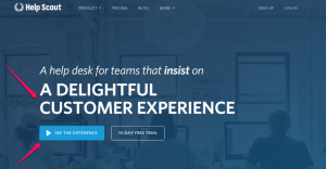
A call to action on a site is to direct a customer toward the next step: buying. Once the customer has decided what product they want to buy, the next thing would be to hit the “Buy Now” or “Add to Cart” button. For a B2B ecommerce website, the CTA should be to the point. Whereas in a B2C website, there is plenty of room for getting creative.
According to Saleslion, a personalized CTA brings in 42% more consumers than generic ones. Here are the examples of B2C and B2B CTA:
B2B:
B2C:

Checkout Process:
After almost everything is completed, the next thing is to go through the checkout process. The B2B and B2C have a huge difference in their checkout processes.
B2B:
As with B2B sales, a lot is at stake, so the checkout process is a mix of several automated and preprogrammed steps. Additionally, human assistance is available to help the customer finish the checkout.
- A few things that must be included in the B2B eCommerce website design are:
- Payment Options like credit cards, ACH payments, checks, etc.
- Human Assistance: Phone call options, product demos, and video chats should be included
- A simple and fast reordering system
B2C:
The steps for completing the B2C checkout process are minimal compared to the B2B. Under this eCommerce model, customers add the product to the cart, apply to the discount offers, fill in the delivery address, make the payment, and receive the order. Here are a few things that a B2C eCommerce website should have:
- Features to add products from the wish list
- Secured Payment Options
- Option to add coupons and referral codes
- Nudges to ensure that the shopping cart is left abandoned
Pricing:
Usually, the pricing seen on the B2C is consistent if the discounts and coupons are kept aside. However, at the same time, the B2B business has varied pricing according to the purchase size. This ultimately leads to having a different set of website designs for both of the websites.
B2B:
- Customized pricing for customers who have been loyal to the business
- Pricing calculator for showing changes in pricing instantly
- For Call to Action “Request a Quote”
B2C:
The pricing customization in the B2C setup comes with special discounts, coupons, sales, and other offers. Ensure to include the following:
- Transparent and consistent pricing
- Fields for adding coupon codes
- 5 Best Ecommerce Website Design Examples
- Requirements to build a high performing ecommerce website
Even with the best tools, the designing process for a website can get messy and complicated. So, before you prepare your website for the big launch, here is a quick checklist that one should go through with their web designers:
Web design checklist: Get ready for your new website
Homepage:

Be it a B2B or B2C ecommerce website design; a homepage plays a pivotal role in shifting random scrollers into customers. A homepage must include the name of the company, the logo, the categories of products you are dealing with, and the search bar to allow the customers to easily find the products they have been looking for.
Let’s talk about them one by one:
- Name and the Logo: Begin designing the homepage by highlighting the business’s name and logo. With this, your customers will get to know who they are shopping with.
- Category Section: At the top of the homepage, add a section for the category where your customer can easily look at all the available options. For example: If you have a clothing business, you can have categories like “dresses’, “sweaters,” and” jeans.” This way, the customers can easily look for the products they want.
- Search Bar: When customers know the product’s name, they won’t like to scroll through all the pages. They can check out the product by typing the name in the search bar.
- Address: If you are dealing with a business, let’s say brick and mortar, it will be quite important for you to provide your address. This is how customers can reach out to your stores and complete the business. Even if you are dealing with a business where you won’t have to deal with the customers on your own, you still need to put in an address to show your business’s authenticity.
- Contact Information: At the end, in the footer section, it’s good to give the contact address of the business so that people can reach out to you in case of any issues. Try to include email addresses, phone numbers, and social media links in this section.
Product Pages:
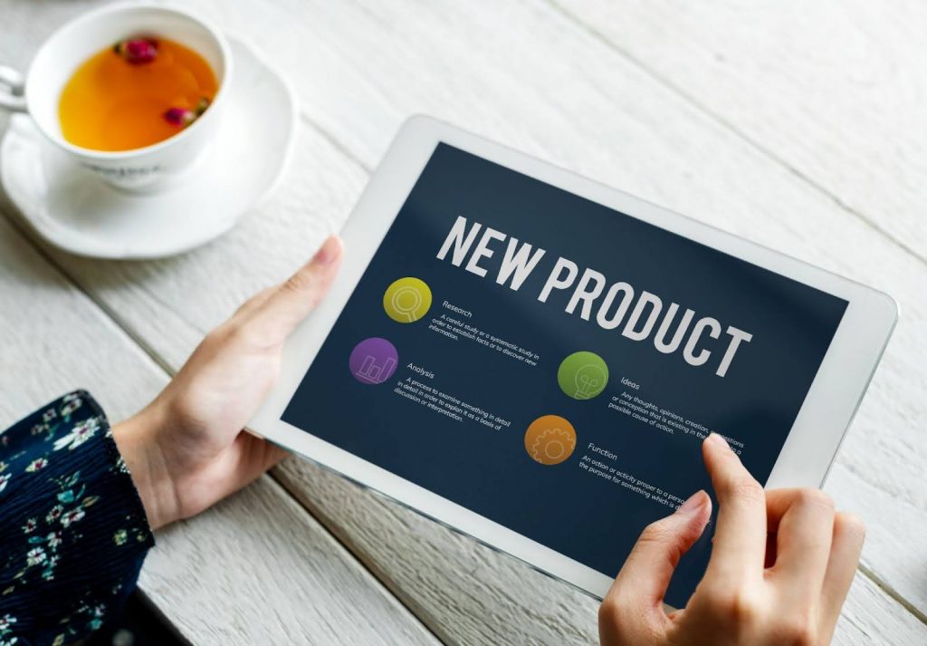
Next are the product pages that need to be taken care of after the homepage. Again, one can have a grid-like or list-type format for the product pages. Finally, there are a few more things where one can make the product pages more creative:
- Visualization: The best way to boost sales on a website is by using visual promotion. One can get as creative as one wants to by using dynamic and creative visual effects throughout the video. In addition, use easy-to-read texts to ensure that the customers can get awareness about special offers or deals. If necessary, use this to share the video over the homepage.
- Details of the products: The biggest disadvantage a person finds while shopping over an eCommerce platform is not being able to touch and see the product themselves. This is where descriptions can help out both customers and retailers. A detailed product description would have all the necessary information to help customers understand all the product aspects. But it will also aid retailers in showcasing their products and increasing their SEO rankings.
Client Testimonials and Pictures:

Photos and testimonials help boost the customers’ confidence in a product. With high-quality images from every angle, one can show how the product will look upon its arrival.
Therefore, another important section that the online stores should include is testimonials. Make sure to keep the testimonials as raw and honest as possible. This is one of the best ways to understand any flaw in the product.
Checkout Page:
The last step for any eCommerce platform is the checkout page. Here are a few things that you should keep in mind while designing this page.
- Encouragement Note: Often, when customers reach the final step of buying, they are hit by the question of whether they are making the right choice or not. Putting up words like “Amazing Choice” or “We are excited for you to try our product” can change the whole way they feel about the product.
They will feel more confident with the purchase. You can also add in “free shipping over XXXX dollars of purchase” to encourage them to buy more products.
- Progress Bar: If the checkout process takes a long time, any business can lose out on a customer. By adding a checkout progress bar, the customer can get an idea of how far along they are in completing the purchase.
- Security Certification: For first-time buyers, making a purchase can be tricky. Over that, trusting a website with the first purchase requires security Certification is the best way to showcase that the checkout page is safe for any money transaction.
Contact Page:

A contact page will have all the legal policies and addresses of the business so that customers can have full-fledged information about the business they are dealing with.
- Contact Information: The contact page on your ecommerce website must consist of the correct address where the business is located, and in a few specific cases, the addresses of owners should also be mentioned. If, in any situation, the customer would want to hold down the business, they can do so by going to the contact page.
- Policies: Before, the customer would want to go through all the cancellations, refunds, and deliveries. All these details can be added in the footer section, where people can easily access all the relevant information.
Other Pages For an eCommerce Website Design:
- Blogs: With blogs, businesses can show how to use products and even help your website rank at the top of the SERP.
- About Us Pages: With the help of About Us Pages, customers can know what the business is all about. Information like the background story of the business, how the business started, and how well they are doing can be written down.
- Galleries: Galleries can be a delightful way of showing all how happy the customers have been with their purchases. This will enhance the business’s brand value.
Why Choose Us for eCommerce Website Design Services
Ecommerce website design plays a vital role in up-leveling your online store. From attracting quality customers to boosting your sales, a well-designed website can provide you with ample benefits. All you need to do is get in touch with an expert website designer to complete the task.
If you are looking for an innovative team of website designers feel free to contact us. Our passionate and hardworking team will work round the clock to provide you with an outstanding website.
To learn more about our services, feel free to call us.


