How to Create an Outstanding Website Design?

Explore By Category
About the Author
Did you know that visuals influence our brains 60,000 times faster than text? The same is true for our website design and presentations. A visually attractive website holds more power to boost sales and generate conversions for your business.
Since the Internet is a significant aspect of our lives, we cannot deny that it has far-reaching impacts. The growing online audience has led to an exponential rise in the number of available websites. While there were only 210 million websites a decade ago, today that number is over 1.8 billion.
With the presence of such massive options, your website gets only 50 milliseconds to form an impression on the viewer. This means that users take less than a second to create an opinion about your website and make decisions accordingly.
Studies show that almost 94% of the first impression of your website depends on how it looks. So, it is natural to optimize a website that interests the user and grabs their attention in one look.
To help you out, we have listed a few web design tips that can help you make an appealing website that stands out from the crowd.
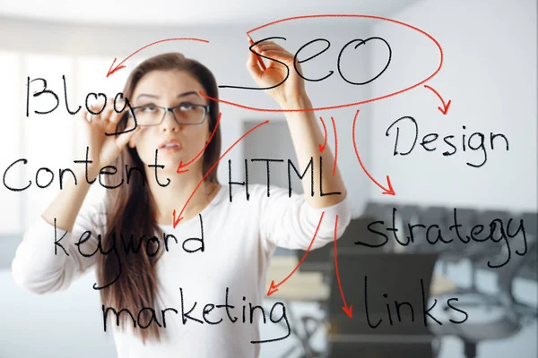
Understanding the Need for Website Designing
The Internet is all about web networking and looking for data distributed over different websites. While surfing the web, you come across numerous pages and sites where you tend to deduce the needed information. Thus, curating the most effective website for your audience is the first step towards creating the impact you wish upon them. Designing a website is one of the most crucial and complicated tasks. Along with the basic foundation, every component must be curated personally, so it effectively radiates your brand and niche.
The style of your website is your first choice, whether to keep it classy, vibrant, sleek, and modern or something that reflects your style. The only thing you should remember is that it should be user-friendly, easy to navigate, and powerful.
Here are 5 of the most useful website design tips to help you get enthralling results.
- A minimal but attractive website
- Readable content
- Effective use of imagery
- Mobile friendly
- Easy to navigate
Let’s discuss each of these tips individually in detail:
Design a Minimal But Attractive Website
In web design, minimalism entails streamlining the user interface by removing extraneous components. Simply put it together: Focus on quality, not quantity. A Stanford survey states that 75% of people prioritize the credibility of your website based on its appearance.

Here is our list of reasons to think about creating a minimalist website in case you’re wondering what other advantages minimalism can provide other than just being beautiful:
Benefits of Designing a Minimalist Website:
- It is in trend.
- Making responsive versions of minimal websites is simple.
- Websites that are minimalist in design load more quickly.
- Users can focus entirely on the goods or services you’re selling by keeping things simple.
- Navigation is intuitive when it is simple.
You can design great minimalist websites, applications, and other digital products by following a few fundamental strategies.
Steps to Make a Minimalist Website Design
Use whitespace: The space in a composition known as “whitespace” or “negative space” is between the elements of the composition. While there are many advantages to employing whitespace, the user experience is improved, and attention is drawn to the webpage content and your goods.
Whitespace gives a design balance. For example, you may fascinate visitors and engage them to hold on to your website for a longer period of time and scroll deeper by paying attention to what fills the space between the primary text blocks.
One of the key principles of a minimalist aesthetic is having a decent amount of whitespace.
Take a look at the stunning use of whitespace on the website of LA fashion and portrait photographer Thomas Slack. Nothing can take consumers’ attention away from the stunning inspiration of his creation.
Combine text blocks: Break up your text into blocks to easily create an impact. Blocks improve how text is perceived by consumers and make the design look lighter.
Short-term memory can only hold seven items at a time, plus or minus two, according to George A. Miller. If you want to learn more, you can read Miller’s original post, but the main concern is that the more information you add to your user website design interface, the harder it will be to use, especially the first time.
Add small details: If a trend doesn’t change over time, it will eventually die. Because minimalism is adaptable and can be changed to suit changing demands, it has been popular for this long. By incorporating little touches, designers experiment and challenge the conventional perception of minimalist websites. These might be ornamental items placed there purely for show.
Flying ornamental signs, underlining, geometric objects and fragments are becoming increasingly common to balance out text, split it, or draw attention to it.
Only at first look does minimalism appear straightforward; to make it lightweight and user-friendly, you must carefully consider each component. Always prioritize usefulness over aesthetics, arrange your content, and work to make the website’s navigation more effective.
Improve Content Readability
Any website’s readability condition directly affects its viewership and sales. It is observed that 44% of visitors leave your website if they don’t find relevant contact information easily.
We often gauge the readability of content by calculating roughly which grade level of children could comprehend the written text. Use website design plugins or other tools to check the readability of your content. If your content is hard to read, consider the following tip to improve your content:
Robots or search engines analyze content readability using a variety of algorithms that are created for that purpose. The Flesch-Kincaid readability score is one of the most prevalent algorithms for determining content readability. Other algorithms include Coleman-Liau, SMOG index, Gunning-Fog, and others.
Tips to improve content readability
1) Use Short and Simple Words: The easiest approach to raise your Flesch-Kincaid readability rating is to divide lengthy statements into multiple shorter ones. When there are short and simple words available, there is no need for you to utilize long and complicated words.
Visitors to articles are looking for information, not grammar lectures. Therefore, you only employ tough and complex terms to demonstrate your vocabulary size, and no one appreciates a show-off.
2) Write conversationally: This is more of a general recommendation than a rule. Just pretend you’re talking to someone else when you write your blog posts. You’ll see that it differs significantly from the way we often write.
Shorter, simpler language and shorter phrases come naturally when writing in a conversational style.
3) Typography: Besides the syntax and vocabulary, we also cannot close our eyes to the visual aspect of the content. A huge impact upon this is made by typography. Every element, from line length to the font and line length, can greatly impact the speed of your reader going through your content.
4) Proper formatting and hierarchy must be maintained: Don’t stop hitting the enter button once you are over with a particular sentence. Too much white space is just a myth, nothing else. This action will ensure that all your sentences have a proper separation and that it’s easier to recognize the end of the sentence.
Also, ensure that you maintain short and tidy paragraphs with a visible difference. Utilize headers and sub-headers frequently to subdivide your content. Using bullet points and tables is also recommended to create presentable content. You may also utilize text decorations to emphasize the main keywords.
5) Use Transition words: These act like connecting words between two sentences that complement each other. Some examples include: but, similarly, for instance, in addition to, etc. These words allow the reader to figure out how different sentences relate to each other. Apart from that, these words also provide a streamlined flow to your article, ultimately providing a smooth reading experience.
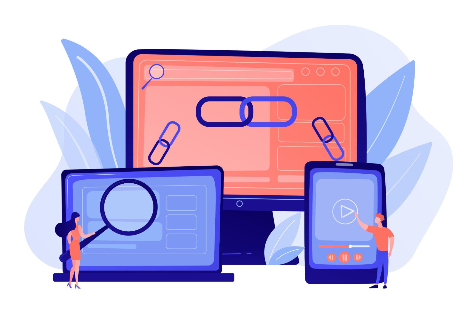
Effective Use of Imagery
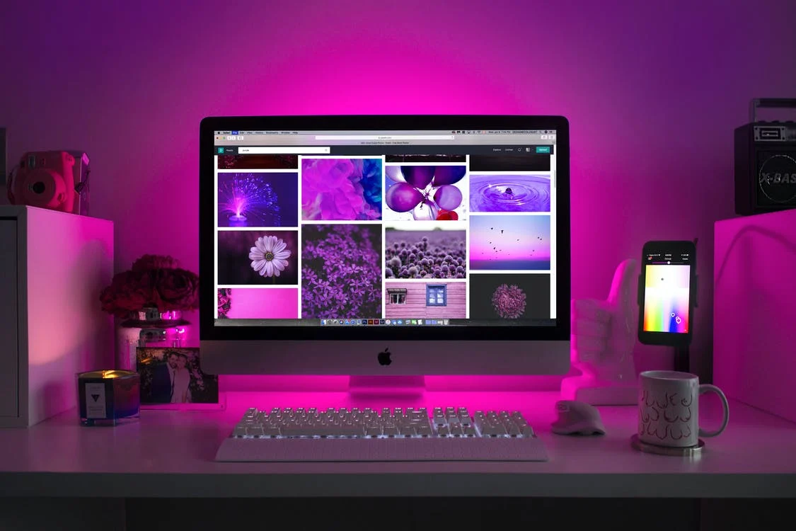
We often hear the quote, “An image is worth a thousand words.” And it’s true to some extent. The right image can add value to your website and drive huge traffic. However, a bad image can potentially destroy your website’s reputation.
According to a survey, 92.6% of people agree that visual dimension is the leading factor that influences their buying decisions. So, to boost sales and revenue generation, your website must have proper image and visual utilization.
Just keep reading, and you’ll get the idea about SEO-friendly, content-relevant images.
How to Choose the Best Website Image?
1) Choose high-quality images: Ensure the images included in your website are of only high quality. Images constructed of high-resolution and large pixels are the best to go ahead with. Not sure about the size? Think what percentage of your users will access it with mobile and what percentage with PC. Upload an image that gives an aesthetic look to your website, regardless of the device.
Remember, an appealing homepage image will increase the time a user spends on your website. Search for websites to find the perfect image content like gifs, memes, etc.
2) Relevancy is the key: Including an image just by considering its aesthetic is never recommended. You must only include images that are pleasant to the eyes and add value to your content. An ideal image makes it easier for a user to understand your website’s content and the one with which they can relate.
3) Include call-to-action (CTA): Want to ensure that a visitor takes a specific action? Create an image double which is a call to action. Data shows that only 3 out of 10 small businesses use CTA on their websites. Brands in the food industry are often witnessed utilizing these strategies. An image with a call to action makes it easier for a consumer to directly access a product whose image he finds tempting enough.
4) Let the image to the talking: Fill up your website design with images that hook the visitors. An image that can convey a message saves a lot of time and energy that would have been required to convey the same message in text form.
We must understand that not all visitors have time to go through long texts, or sometimes, they are simply not interested. Hence, to get the indulgence of both audiences, you must create a balance of texts and images.
5) Showcase real people: Humans tend to get interested in things that they can relate to. Therefore, selecting an image that includes real persons is one of the best ways to enhance the conversion ratio of any website. For example, suppose you own a website selling sunglasses. Including people wearing those sunglasses will provide an idea to the visitors of how those will look on their faces. Hence, the chances of conversion automatically increase.
6) Optimize images for SEO: Regardless of your website type, you must optimize each image for SEO. But before making that appropriate from an SEO perspective, ensure that the images are of high quality. After that, ensure the name image file is so that search engines can easily index it.
Also, ensure to name the image after a keyword it represents. For example, using “pic1.jpg” is a big “NO”. Also, while you are naming the images, be very particular about not adding any spaces or punctuations, and never ignore the alt text.
How to Choose the Right Image File Type for Websites?
If you are unsure which image file you should be using, let’s explain them briefly to help you decide.
- JPG: This type of file can easily handle colors in a small and efficient file size. It should be used for photographs only. While using a JPG file, you don’t have to worry about having a humongous file, which increases image loading speed.
- PNGs: This type of file should be used for graphics, especially if they use flat or large color areas. Most of the designs are included in this image type, for example, infographics, text-heavy images, logos, etc. A transparent background is also utilized by PNGs (ideal for creating logos).
Make Your Website Mobile friendly

Mobile phones play a major role in expanding website visits. It was recorded that smartphones hold a 63% share of e-commerce website visits. Moreover, 50% of e-commerce revenues are generated from mobile users.
Thus, it is important to ensure that a website design is responsive and easy to load on mobile phones. Mobile devices generate a huge percentage of web traffic and if your website design fails to be mobile-friendly, it might lose that audience.
Hence, follow the tricks mentioned below to ensure that your site is quick and responsive even on mobile devices:
Tips for a Mobile-Friendly Website:
1) Choose a mobile responsive theme or template: Before moving forward with any other step, one must ensure that the theme he selects for his website is responsive for mobiles too. As the template will build the base of your site, and if the base only fails to be mobile-friendly, how can anyone expect the rest of the website to be? The two most popular mobile-friendly themes are- Squarespace and Wix.
2) Keep the content short but impactful: You’re not free from your duties after choosing a mobile-friendly theme. It is big but not the only step. Once you are done selecting the theme, start paying attention to your content. For example, ensure that the forms featured or the sign-up is smooth and can easily be assessed by a mobile. Also, pay attention to the length of the forms; lengthy forms can irritate the users trying to access the form from a mobile.
Also, ensure that the content on your site is brief. Instead, try to present your readers with compact but crisp chunks of text.
3) Keep the design simple: A complicated website with much clutter is confusing on any screen, but it becomes all the more difficult when a visitor is accessing a site with a mobile phone. Use these WordPress Themes to keep your website design simple as well as valuable.
Avoid creating a messy website; instantly create a website with less but tidy content. A minimalistic but clean website attracts more traffic than a website that loads unorganized information. Also, the less the website content, the faster its load time will be.
Apply this practice to your menu as well. For example, if your website consists of a load of pages and categories, you might think that providing large icons on the screen might make sense. However, try to cut them down for mobile only to the most important options. You may also go with the addition of the hamburger button on mobile. This way, not much mobile screen space would be consumed, but the user could easily access them if he wants to.
4) Consider the button size: Clicking on a button with a mouse is simple, but it becomes a bit tricky when we have to do the same with our fingers on a mobile screen. Especially if your website buttons are small and quite close to each other, the process not only becomes tough but also irritating.
Implementing bigger buttons is the best thing to prevent your visitors from this irritation. Also, be very cautious about their placement.
The best way to ensure that the website design placement is best suited for both PC and mobile users is to test them yourself. Run your website on your PC and cell phone, and only if you are satisfied, make your changes live.
5) Perform regular tests to check mobile experience: Regular website analysis is the best thing to ensure that your website provides a good experience to mobile users. First, test your website to ensure it is still relevant to the mobile user. If not, ensure to make the required changes and updates. The reason to put so much emphasis on regular is that the faster problems will get discovered, the sooner they’ll get resolved, which will ultimately result in greater traffic retention.
Remember, if your website is mobile-friendly in the present, there’s no guarantee that it will remain so in the future. Hence, keep yourself updated about the latest trends and updates that will help your website remain mobile-friendly.
Make It Easy to Navigate
Crowding your website with several unnecessary elements can make it difficult for users to easily navigate through it. According to GoodFirms, almost 85% of small businesses have lost business deals due to website overcrowding.

Every website consists of a form of navigation. However, not every website’s navigation works. Almost every time, the website’s navigation is arranged by the website designers with expertise in building an attractive and responsive website. Still, when it comes to navigation, they might be a rookie.
Here the role of an SEO expert kicks in; however, if you can’t afford or simply want to hire an expert, here are a few things you could follow to make your site easier to navigate.
How to Improve Your Website’s Navigation?
Keep it consistent: Consistent navigation in both conditions, I.e., how and where the consistent appears on your website, helps the user to easily navigate and find the information more quickly on the website. Visitors often lose their onsite bearings if your navigation tends to change frequently from page to page.
A clear separation of categories: Ensure that all the categories featured on your website are easy to differentiate. If a site’s navigation contains multiple sections or categories, they must all be visually and clearly defined. To put it simply, the headings of the categories must have a clear difference from the sub-categories. This should be practiced even if the categories are simple links.
Make all navigation elements clickable links: When a site owner is utilizing multiple categorical divisions in the navigation of their site, all the headings included must be clickable links. This should even be implemented with the drop-down menus.
Use accurate navigation titles: All website visitors must have a basic idea of what they can expect to discover on a page before clicking a navigational link. This practice should be consistent regardless of the page being the main navigation link or an internal text link. Ensure that the texts that are used in your website design to describe the linked page are accurate. Misleading and cryptic descriptions annoy and irritate a user, which may lead to site abandonment.
Make use of ALT text: Although it must be implemented on every image, one should be more cautious in case the images are linking to other pages. Ensure to include the ALT attribute along with the descriptive text. Hence, the user is aware of what kind of content the link can contain.
Ensure that your search feature is not broken: When a user is using an in-site search feature, it must always provide relevant results. The misspellings must be covered and compensated, and the result must be very close to the keywords entered in the search bar.
Conclusion
While designing a website, the owner must be very cautious. Along with considering the website design, an individual should also not ignore the SEO best practices. Search Engine Optimization will decide whether your website will be displayed on the search result page once the keyword is searched. The website design tips mentioned above help retain the visitor to a great extent.
Still have doubts? Consult our website design specialists for more expert tips and assistance. We have a team of well-trained and experienced web designing experts ready to curate an attractive website for you that will increase your visitors and sales numbers. So, you don’t have to compromise with a sad-looking or unresponsive site anymore; reach out to us and create a responsive and beautiful-looking website.